
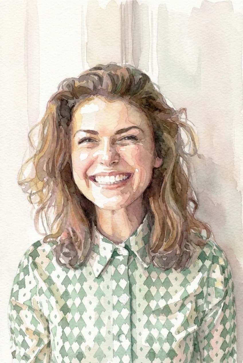
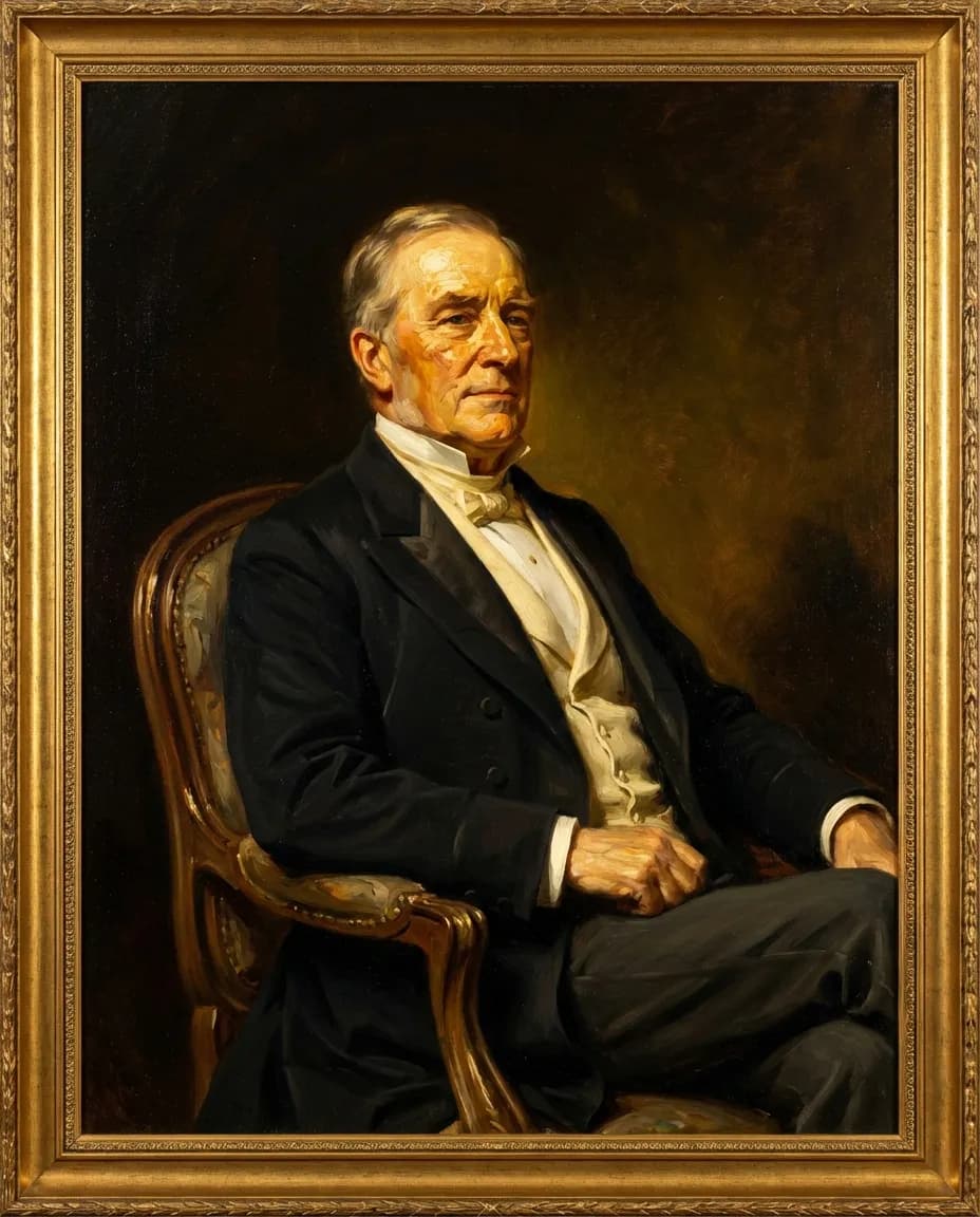
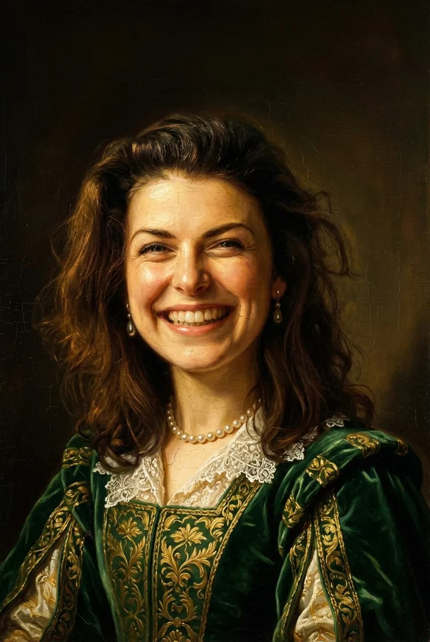
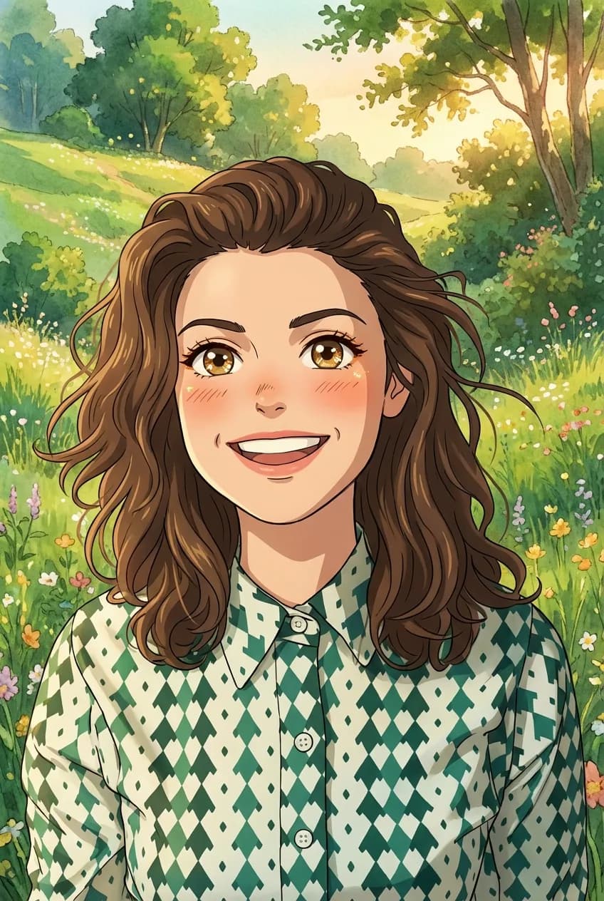

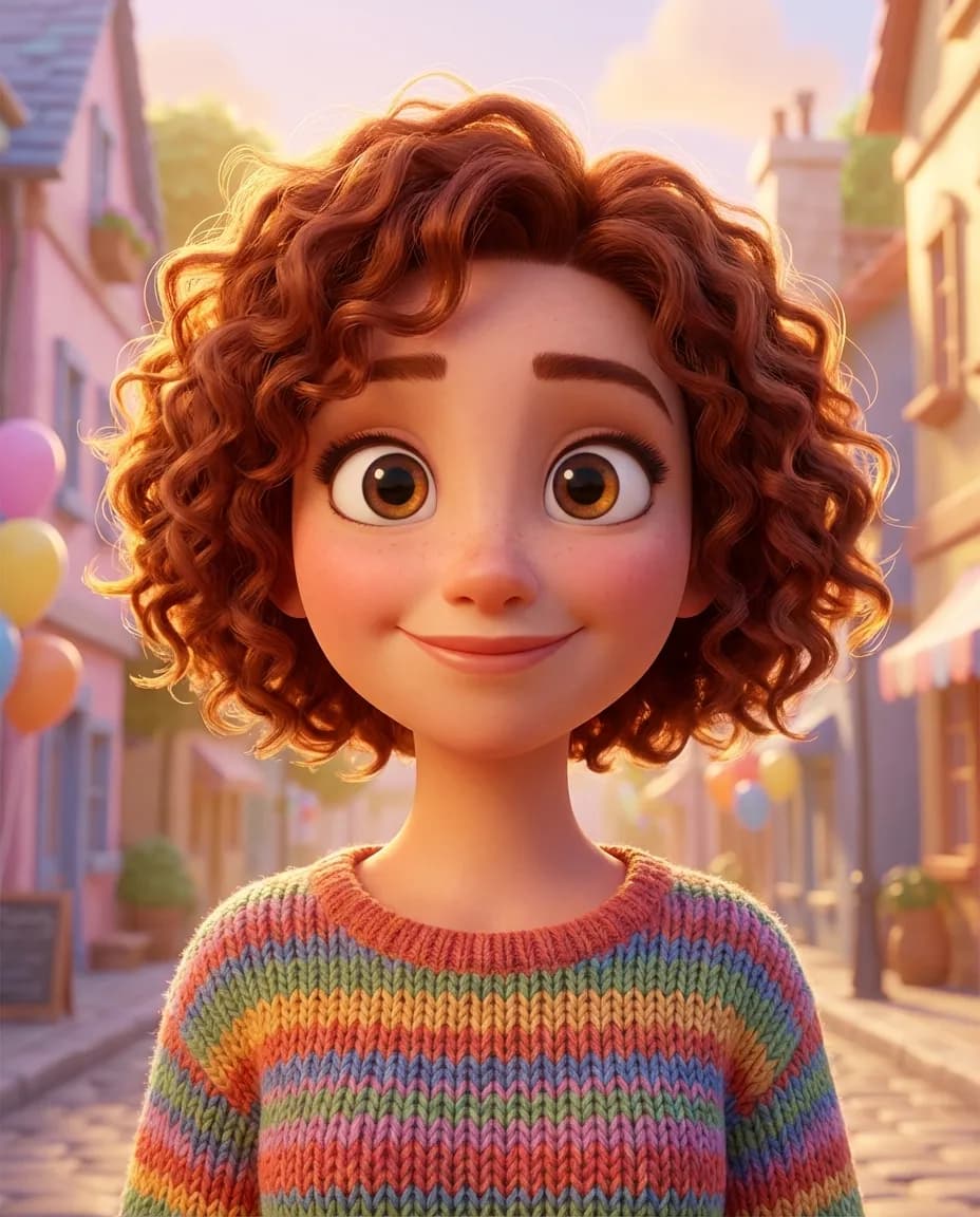
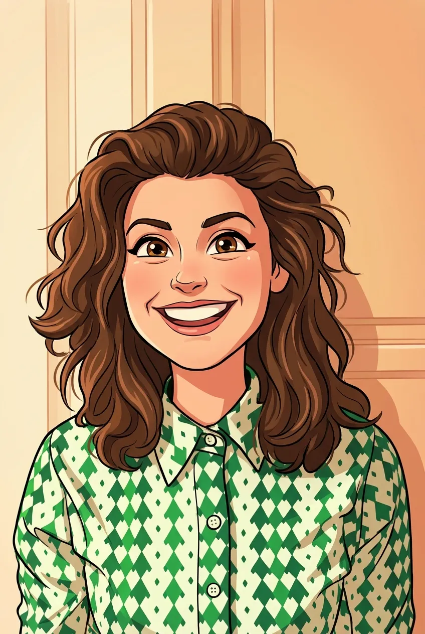
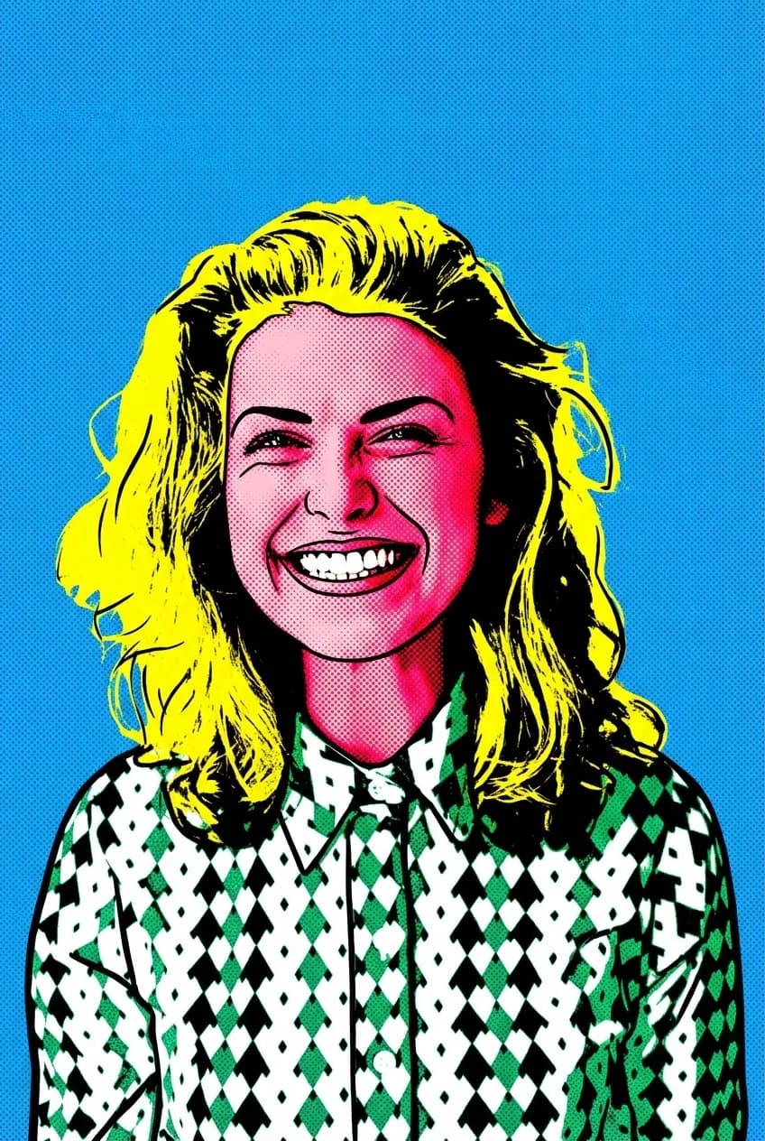
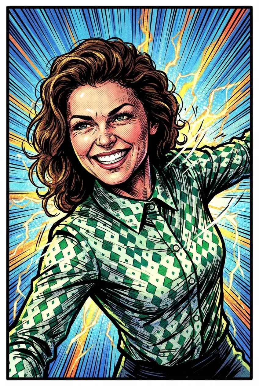
Picking a portrait style sounds simple until you are looking at twelve thumbnails and your favourite photo, and suddenly nothing feels right. That is the moment most people give up, pick the first cartoon style they see, and end up disappointed. The trick is to stop asking which style is objectively best (none of them are) and start asking which style fits this specific photo, this specific wall, and this specific person. A great portrait style does three things at once: it preserves what makes the subject recognisable, it suits the room or context the final image will live in, and it carries the emotional weight you want it to. Get those three lined up and the choice becomes obvious. Get them out of alignment and even the most technically impressive AI output will feel off.
Start with the photo, not the style
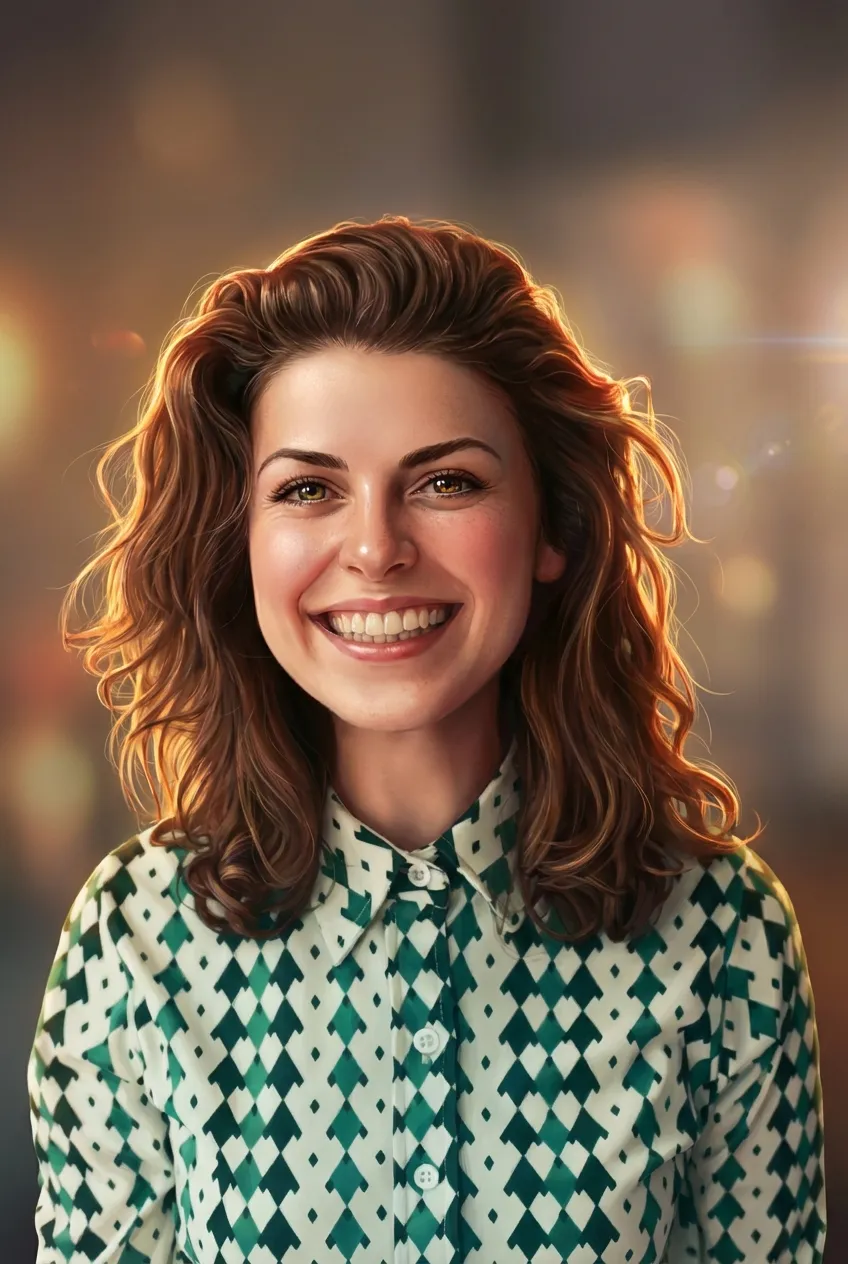
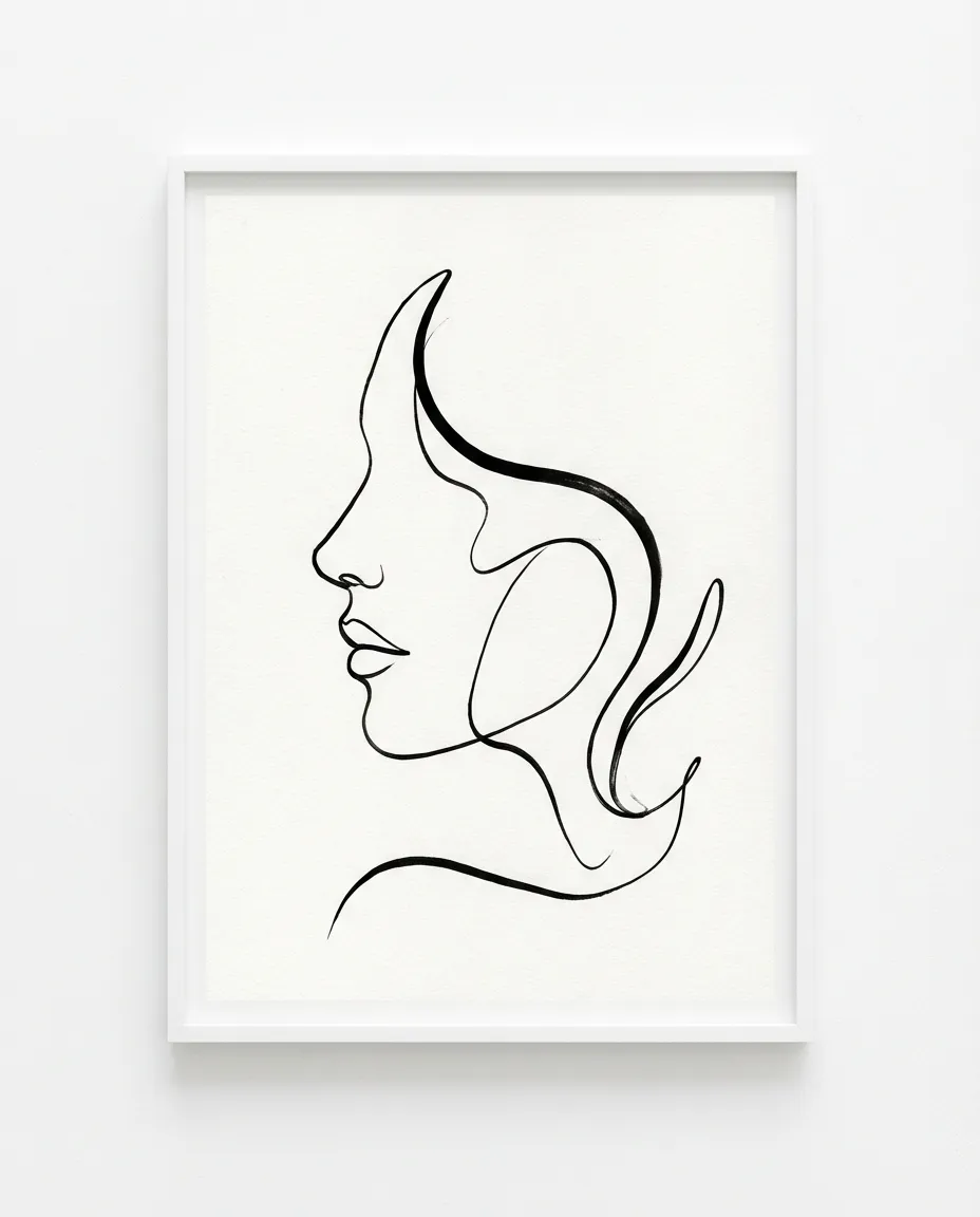
Before you even open a style picker, study the photo. Is the lighting soft and diffuse, or hard and directional? Are the colours muted or saturated? Is the subject facing the camera or caught in candid mid-action? Soft, diffuse, evenly-lit portraits are the workhorses of AI art, they render beautifully in every style on the planet. Harder lighting with deep shadows tends to suit oil painting, Renaissance, and comic book styles, because those styles are designed around bold tonal contrast. Candid action shots usually translate best into anime, 3D animated, or cartoon styles, where motion and exaggeration are built into the aesthetic. If your photo is mostly profile or three-quarter, minimalist line art shines; if it is a tight head-and-shoulders composition with great eye contact, watercolor and oil painting are hard to beat.
Photo quality matters more than people expect. A grainy, low-resolution phone photo from 2014 can be brought back to life by the AI, but you will get noticeably better results from a 2 megapixel or higher image where the subject takes up at least a third of the frame. If you are working from an old or low-resolution source, lean into styles that are forgiving of detail loss: watercolor, pop art, comic book, and cartoon. Avoid hyper-realistic options like oil painting and Renaissance for those photos, because those styles are designed to add detail rather than hide it.
Match the style to where it will live
A portrait is a piece of decor as well as an image. The same style choice that looks gorgeous on an Instagram profile can feel clumsy on a living room wall, and vice versa. Three quick rules cover most situations. First, for canvas prints destined for shared living spaces, lean toward watercolor, oil painting, or Renaissance. These styles look intentional on a wall, they age well, and they do not date the way a more trend-driven style might. Second, for nurseries, kids rooms, and playful corners, lean into 3D animated, cartoon, or Ghibli style, which read as warm and approachable rather than formal. Third, for office walls, gallery spaces, and modern interiors, the minimalist line art portrait and digital art styles work in almost any palette and never compete with the room around them.
Frame and mount choices feed back into style choice too. A thin black frame and pale matte amplifies the elegance of watercolor and line art. A thick wooden frame loves oil painting and Renaissance. Frameless gallery-wrapped canvas suits pop art, comic book, and 3D animated styles, where bleeding the artwork to the edge is part of the appeal. If you are buying for someone else and you do not know how they will frame it, watercolor is the safest universal choice because it works in almost every frame and on almost every wall colour.
Match the style to the subject
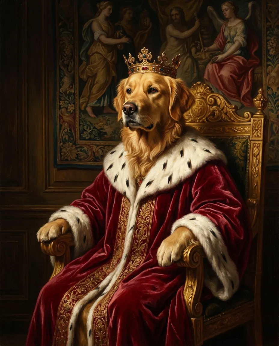
Different subjects flatter different styles. People with strong, sculpted features (think a defined jawline, distinctive eyebrows, or a memorable smile) shine in oil painting and Renaissance, where the medium is designed to render structure. Softer faces, kids, and babies often look more like themselves in watercolor and 3D animated, which lean into roundness and gentle gradients. Pets are an interesting case: dogs and cats look spectacular in almost everything, but the royal pet portrait style is wildly popular for a reason, the contrast between a regal velvet robe and a goofy dog face is genuinely funny and never gets old. Cats specifically tend to look amazing in oil painting, because their natural poise translates so well to formal portraiture.
Couples and families are another category where style choice shifts. For couples, minimalist line art is the single most popular pick because it is romantic without being saccharine, it sits well on bedroom walls, and it makes a fantastic anniversary gift. For larger family groups, anything with strong simplification works best: watercolor, cartoon, and Ghibli all flatten the visual complexity that comes with three, four, or five faces in the same composition. Avoid hyper-real styles for large groups unless the source photo is already studio-quality, because each face will pull detail from the same finite render budget.
Match the style to the emotion
Every portrait style carries an emotional register. Watercolor feels nostalgic, tender, and a little wistful. Oil painting and Renaissance read as respectful and timeless, which is why they are popular choices for memorial portraits and milestone gifts. Anime and Ghibli style portraits feel hopeful and a touch fantastical, which makes them lovely for graduation gifts and gifts for younger family members. Pop art and comic book are confident and a little brash, in the best possible way. 3D animated reads as joyful and friendly. Digital art and minimalist line art read as contemporary, intentional, and a little restrained.
Think about what you want the recipient to feel when they unwrap the canvas or open the digital file. If the answer is “loved,” watercolor. If the answer is “respected,” oil painting. If the answer is “delighted,” cartoon or 3D animated. If the answer is “seen,” minimalist line art. If the answer is “made to laugh,” royal pet portrait or pop art. Lining up the emotional register with the relationship is the single biggest predictor of whether a gifted portrait lands or falls flat. It is also the part most people skip in favour of just picking whatever style looks coolest in the demo grid.
When in doubt, shortlist and preview
If you have read this far and you are still torn between two or three styles, that is actually a great place to be. FrameArto previews are free to edit and regenerate, which means you can preview your top pick, decide it is not quite right, and regenerate in a different style without paying anything extra. Most successful buyers shortlist two styles before previewing, run their photo through both, and let the actual output make the final call. It is faster than agonising and it almost always produces a better result than any amount of upfront analysis.
A good shortlisting heuristic: pair one safe pick (watercolor, oil painting, or digital art) with one bolder pick (pop art, comic book, cartoon, or royal pet). The safe pick guarantees you have a wall-ready result; the bolder pick gives you the chance of being delighted. If you are buying for someone else, lean about 70 percent toward their taste and 30 percent toward yours, the gift is for them, not for you. And if you are buying for yourself, lean the other way; the gift you give yourself is allowed to be a little indulgent.
Finally, do not overthink it. AI portraits are not heirlooms in the way a commissioned oil painting is, they are joyful, accessible, fast, and (digitally) endlessly reproducible. The best way to learn what works for your photo is to actually try a style, see the result, and adjust. The Portrait Style Finder above is built around exactly that loop, browse, preview, retry. Start there and trust the process.