Watercolor vs Oil Painting Portrait, Which Suits Your Photo?
A founder-level comparison of watercolor and oil painting portrait styles. Visual differences, which photos suit each, room fit, price, durability, and when to choose a hybrid approach.

Builds AI art tools that real customers actually love. Obsessed with the craft of digital portraiture and the small details that make a portrait feel like a gift.
If you have ever scrolled through a gallery of portrait styles and felt your eyes flicker between the airy translucence of watercolor and the deep, almost edible richness of oil paint, you are not alone. Roughly four in ten FrameArto customers ask us, in one form or another, the same question: which one suits my photo? The honest answer is that both can produce something extraordinary, but they reward very different photos, moods, and rooms. This guide is the version of the answer I wish I could hand every customer before they pick a style.
I am going to walk you through where each style comes from, what each one actually does to the underlying image, which kinds of photos play to their strengths, and how to think about price, longevity, and room fit. I will also flag a few situations where a hybrid (watercolor base with oil-style accents) genuinely wins. By the end you will be able to answer the question yourself, in a single sentence, for the photo you have in mind.
A very short history of two old friends
Watercolor as we know it crystallised in 18th and 19th century England. Artists like Turner pushed it from a pleasant sketching medium into something serious, capable of weather, light, and emotion. It earned a reputation for spontaneity. You cannot over-rework a watercolor: the paper remembers everything, and water will not be argued with. That tension is exactly what gives the medium its charm.
Oil painting, by contrast, is the medium of cathedrals and palaces. From Van Eyck onward, oil was the prestige format for portraiture in Europe for nearly five hundred years. Slow-drying, layerable, capable of impossible depth, oil is the medium of presidents, popes, racehorses, and titans of industry. When AI generates an oil-style portrait, it is leaning on this enormous visual canon. That heritage is half the reason oil portraits feel so substantial.
What each style actually does to your photo
Watercolor: subtraction and suggestion
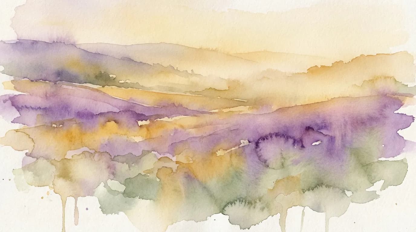
A watercolor portrait simplifies. It pulls out the few shapes and tones that define a face or a scene and lets the paper, or in our case the digital substrate, breathe through the rest. Edges go soft. Colors bleed slightly into each other. Backgrounds dissolve into atmospheric washes. The result feels like a memory: clearly your dog, clearly your spouse, but rendered with the kind of poetic looseness a photograph cannot offer.
Oil: addition and presence
Oil works the opposite way. It builds. Every detail is articulated, every shadow has weight, every highlight has a tactile sheen. An oil-style portrait commands a room. It says, this person, this animal, this moment, mattered enough to be carved out of paint. Backgrounds are often deeper and more dramatic. Skin and fur take on a luminous quality that watercolor simply cannot match.
“Rule of thumb I use with friends: if you want the portrait to feel quietly present, choose watercolor. If you want it to feel important, choose oil.”
Which photos work best for each style
This is where the conversation gets practical. Not every photo loves every style equally. Here is how I think about the match.
Photos that thrive in watercolor
- Outdoor and natural light shots, especially golden hour, where the original photo already has soft, diffused tones.
- Candid moments rather than posed ones. Watercolor flatters spontaneity.
- Pets, especially fluffy ones (think Cavaliers, Pomeranians, long-haired cats), because soft edges read as fur beautifully.
- Children and babies, whose features benefit from gentleness rather than heavy modelling.
- Weddings and engagements where you want the portrait to feel romantic rather than ceremonial.
- Couples and family moments where the emotion of the scene matters more than the literal detail.
Photos that thrive in oil
- Studio or well-lit indoor photos with deliberate composition.
- Strong facial expressions where you want every nuance preserved.
- Portraits intended as the centerpiece of a wall, not a supporting piece.
- Memorial portraits where gravity and permanence are part of the message.
- Photos with dramatic lighting, side light, or strong contrast.
- Animals with bold features (Bulldogs, Boxers, horses, big cats) whose musculature and structure deserve to be modelled.
Color palette and emotional temperature
A watercolor portrait tends toward a higher key. Even when the underlying photo is dark, the medium will lift it. You end up with a palette that breathes: pastel transitions, lots of negative space, occasional pops of saturated pigment where the artist (or the AI) decided to focus the eye. Emotionally, watercolor reads as warm, gentle, optimistic, nostalgic.
Oil sits in a lower key by default. Backgrounds are richer, often deep umber or near-black, with light directed onto the subject like a stage spotlight. Even cheerful oil portraits carry a hint of gravitas. The palette is denser, often using earth tones (burnt sienna, raw umber, ivory black, lead white) that read as classical and timeless. Emotionally, oil reads as serious, present, reverent, and confident.
Room and decor fit
A portrait is not just an image, it is also a piece of furniture for your wall. Where it lives matters.
Watercolor sits beautifully in spaces that are light, soft, and a little airy. Scandinavian interiors, coastal homes, modern farmhouses, nurseries, kitchens with white shaker cabinets, and bedrooms with linen bedding all play well with the medium. It also pairs effortlessly with other watercolor pieces, botanicals, and minimalist line art. If your home leans Pinterest-bright, watercolor is almost certainly the right call.
Oil belongs in spaces with depth and warmth. Libraries, snug living rooms with built-in shelves, dining rooms with rich wallpaper, traditional studies, even modern apartments with a strong moody palette of forest green, navy, oxblood, or charcoal. Oil portraits look at home above a mantle, behind a leather chair, or anchoring a gallery wall of vintage pieces. They hold their own against heavy furniture in a way watercolor can struggle to do.
“A useful test: walk into the room where the portrait will hang, look at the largest piece of furniture, and ask whether it has the weight of a brass-handled chest of drawers or the lightness of a linen sofa. The answer almost always points to the right medium.”
Price, durability, and longevity
For physical watercolor and oil paintings (the traditional, hand-painted kind) the price gap is enormous. A commissioned oil portrait can run into the tens of thousands of pounds. Watercolor commissions are typically cheaper, faster, and lighter to ship and frame.
For AI-generated portraits printed on canvas or paper, the economics flatten. The same hardware that produces a watercolor file produces an oil file, so the cost difference at FrameArto is essentially zero. What changes is the print substrate you might choose. Watercolor often looks best on textured fine art paper, which keeps the medium feeling true to its origins. Oil sings on gallery-wrapped canvas, where the canvas weave subtly catches the light and mimics the texture of actual paint.
On durability: with modern archival inks, both styles will last a century or more behind glass or under a UV-protective canvas coating. You really do not need to worry about your portrait fading in your lifetime. What you should worry about, briefly, is hanging position. Keep either style out of direct sunlight and away from high-humidity areas like bathrooms, and you will be fine.
When to choose each, a decision tree
If you are still on the fence, here is the cheat sheet I give to friends asking me at dinner.
- Choose watercolor if: the photo is candid, soft, or outdoors; the room is bright; the gift recipient leans modern or feminine; or the subject is a child, baby, or fluffy pet.
- Choose oil if: the photo is formal or studio-lit; the room is traditional or moody; the recipient leans classic, masculine, or institutional; or the portrait will be a memorial centerpiece.
- Choose both, in a diptych, if: you want one of each subject (say, the two children, or the dog and the cat) side by side. They actually pair well when given equal weight.
Hybrid styles, when watercolor meets oil
There is a third option that almost nobody talks about. Some of the most interesting portraits we generate at FrameArto blur the line between the two. Picture a watercolor wash for the background and clothing, with oil-style modelling on the face. Or an oil portrait with watercolor splash accents that suggest motion. These hybrids do not always work, but when they do, they produce portraits that feel modern in a way pure watercolor or pure oil cannot.
My own home has one of these. It is a portrait of my dog rendered with an oil-style head and a watercolor body, on a cream background. People walk in and ask about it, every single time. That is the hybrid working at full power.
Common mistakes I see people make
After helping thousands of customers choose between these two mediums, the same handful of mistakes come up over and over. I will save you the trouble of making them yourself.
- Choosing oil because it sounds more serious, then hanging it in a bright modern kitchen where it looks heavy and out of place. The room always wins this fight.
- Choosing watercolor for a senior dog who deserved an oil portrait, simply because the customer associated watercolor with pets. Watercolor flatters fluffy and young. Oil flatters venerable.
- Choosing the same medium for every portrait in the house, when a mix would have been more interesting. A single oil portrait surrounded by three watercolors can be the perfect anchor for a gallery wall.
- Underestimating frame matter. A great watercolor in a bad frame looks worse than a mediocre oil in a great frame. Spend a third of your art budget on framing if you can.
- Ignoring the lighting in the room. Oil paintings under harsh overhead lighting look flat. Watercolors in dim corners disappear. Look at the room at the time of day you will see the portrait most.
A word on the AI side of this conversation
Both watercolor and oil styles, when generated by AI, are built on enormous training datasets of the real medium. A watercolor portrait generated today is leaning on the visual heritage of every great watercolorist whose work has been digitised. The same is true of oil. This is partly why AI portraits can feel surprisingly authentic: the model has internalised what a watercolor portrait should look like, and what an oil portrait should look like, with a precision that took human painters centuries to develop collectively.
What that means in practice is that the difference between AI watercolor and AI oil is not just a filter applied to the same base image. The two styles are produced by genuinely different generation pathways, with different reference data and different prompt structures. A good AI service treats them as distinct disciplines, not as interchangeable presets. If you see a watercolor option and an oil option that look like the same image with the saturation adjusted, that is a sign the service did not invest in either style properly.
The honest verdict
Both styles are legitimate. Both can be glorious. The difference is not quality, it is voice. Watercolor whispers. Oil declares. Pick the one whose voice fits the room, the recipient, and the moment you are trying to honour. And if you find yourself genuinely torn, generate both. The free preview costs you nothing, and seeing the same photo rendered in both styles side by side will resolve the question in under a minute.
For most homes and most photos, I quietly lean watercolor. It is the safer, friendlier, more contemporary choice. For occasions that demand a piece of furniture as much as a piece of art, I lean oil. For everything in between, I trust the photo to tell me what it wants to be. The medium follows the moment, not the other way around.
One last small piece of advice. If you do generate both and you still cannot decide, send the two previews to one friend whose taste you trust, and ask them which they would rather receive as a gift. The answer is almost always the right one. We are usually clearer about what other people should have than about what we should have ourselves.
Frequently Asked Questions
The questions readers ask us most about this topic.
Is a watercolor portrait or an oil painting portrait better for a wedding gift?
For a couple in their first home, watercolor usually wins because it suits modern interiors and feels romantic rather than formal. For a milestone anniversary (25th, 40th, 50th) in a more traditional home, an oil painting portrait carries the gravitas the occasion deserves.
Which style preserves likeness better, watercolor or oil?
Oil generally preserves more literal detail, especially in facial features and clothing texture. Watercolor preserves mood and atmosphere better. For a portrait whose primary job is to look exactly like the person, oil is the safer choice. For a portrait whose job is to evoke a feeling, watercolor wins.
Will a watercolor portrait look cheap next to an oil portrait?
Not at all. Watercolor is a serious medium with a serious history, from Turner to Sargent. Printed on textured fine art paper and framed properly, watercolor commands the same respect as oil. The two simply speak different languages.
Do dark photos work for watercolor portraits?
They can, but the medium will lift the tones. If your photo is very dark and you want the portrait to feel moody, oil is a better match. If you are happy with the AI brightening the scene into something softer, watercolor will still produce a beautiful result.
What size should I print a watercolor portrait versus an oil portrait?
Watercolor reads beautifully at small to medium sizes (8x10 up to 16x20) because the soft edges keep working close up. Oil portraits gain a lot at larger sizes (20x30 and above) because the detail and contrast give the eye more to feast on from across the room.
Can I combine watercolor and oil styles in one portrait?
Yes, hybrid portraits exist and can be stunning. A common approach is an oil-modelled face on a watercolor body or background. Generate a free preview in each pure style first, then ask for a hybrid if you want to experiment.
Which style is better for pet portraits?
Fluffy or long-haired pets (Cavaliers, Pomeranians, long-haired cats, Maine Coons) tend to bloom in watercolor because soft edges read as fur. Short-haired and muscular animals (Boxers, Bulldogs, horses, big cats) look more imposing in oil. For a dog you want to look majestic, choose oil. For one you want to look soft and beloved, choose watercolor.
Are watercolor and oil AI portraits the same price?
Yes. At FrameArto, both styles cost the same because the underlying generation cost is identical. The only price difference comes from the substrate (paper for watercolor, canvas for oil), and even then the gap is modest.
See what your photo can become.
Generate a free preview in three styles. No credit card, no commitment, results in under three minutes.
Start My Free Preview